
DVD-quality lessons (including tabs/sheet music) available for immediate viewing on any device.
Take your playing to the next level with the help of a local or online banjo teacher.
Weekly newsletter includes free lessons, favorite member content, banjo news and more.
Premier Sponsors


|
Please note this is an archived topic, so it is locked and unable to be replied to. You may, however, start a new topic and refer to this topic with a link: http://www.banjohangout.org/archive/334309/2
Nashvolk5 - Posted - 09/06/2017: 12:29:04
I just discovered the chatroom through this topic, and I really like it. If I'd known it was here, I would have been dropping in there all the time. I think it'd be a good idea to put the link in the new website. Just a bunch of folks talking about banjos and music like a CB radio! Maybe if the link were more prominent, it'd have more new visitors.
banjoman56 - Posted - 09/06/2017: 14:14:03
It will take a little getting used to, but I think I'll like it fine Eric. Thanks for all the work you put into the site. It's a big help to a lot of people while trying to navigate this banjo journey!
banjo bill-e - Posted - 09/06/2017: 14:25:42
I'm another who cannot read the text on the names of the various forums. I was getting red print on a beige background. Please provide some contrast!
banjo_brad - Posted - 09/06/2017: 15:45:29
The easiest colors for reading, to many, is the good old paper look of black print on white background. Maybe an option for us desktop old fogeys who have trouble with colors that bleed into each other.
I've tried the white print on black, which worked OK on the old CRT screens, but not on the new ones. At one time, way back in the early days, I even used yellow print on a blue background.
Please think hard about providing a Black on White print option!
Mark Douglas - Posted - 09/06/2017: 18:44:04
I'm having difficulty finding the search bar on the home page.
Also, I don't know how to access specific makers in classifieds section.
For example, if I click on classifieds, then banjos....how would I look at Gibson only?
Thanks.
Cyndy - Posted - 09/06/2017: 18:59:42
In the classified section, the Advanced Search accordion seem to be closed by default. That's good!
When I click on a maker to view the list of banjos for sale, the accordion is open on the results page--very prominent--and the results are hidden below the fold.
If there's a featured banjo at the top (visible) it's easy to think that's all there is. If there isn't, it's easy to think clicking on the maker didn't do anything.
Short of it is, it would be great if the accordion was closed by default on the results page so the banjos for sale would be visible without scrolling. :)
Edited by - Cyndy on 09/06/2017 19:01:28
Nick Danger - Posted - 09/06/2017: 19:33:21
quote:
Originally posted by Cyndy
In the classified section, the Advanced Search accordion seem to be closed by default. That's good!
When I click on a maker to view the list of banjos for sale, the accordion is open on the results page--very prominent--and the results are hidden below the fold.
If there's a featured banjo at the top (visible) it's easy to think that's all there is. If there isn't, it's easy to think clicking on the maker didn't do anything.
Short of it is, it would be great if the accordion was closed by default on the results page so the banjos for sale would be visible without scrolling. :)
"Accordions? ACCORDIONS?? Wee doh need no steenkeeng accordions!!"

banjohood - Posted - 09/06/2017: 20:15:36
To me, WAY better! Especially on a smartphone! I can see you're still tweaking and working out bugs, but wow I like it so much more, easier to navigate, looks good on a smartphone. Looking forward to the rollout.
schlange - Posted - 09/07/2017: 10:16:15
quote:
Originally posted by Mark DouglasI'm having difficulty finding the search bar on the home page.
Also, I don't know how to access specific makers in classifieds section.
For example, if I click on classifieds, then banjos....how would I look at Gibson only?
Thanks.
Search bar is in the main (right) nav at the bottom. The magnifying glass.
Browsing classifieds by brand works a lot like it does on the live site. You've got "Popular Makers" on the left of the classifieds homepage, or you can do an advanced search and search by make.
WayneConrad - Posted - 09/07/2017: 10:19:10
RE font size: You can embiggen the font on most browsers by holding down the ctrl key and tapping the "+" key on the far right side of your keyboard (the one next to the numeric keypad). This works on any site, and is preserved as you navigate from one page to another on a site.
schlange - Posted - 09/07/2017: 10:19:12
quote:
Originally posted by LynneOn the check IP bolt the script that comes up is blue writing on a black background
Very hard to see.
Fixed!
schlange - Posted - 09/07/2017: 10:20:44
quote:
Originally posted by wizofosDid not find any links to my groups on your new design.
The groups feature is currently disabled in the new design... we wanted to get the site launched without the delay of hassling with cleaning up all the Group tools. Honestly, the Groups don't get a ton of use, so they may not come back. If they DO come back it will be in an upgraded manner to encourage more use, since they're not worth the hassle given the current usage level.
schlange - Posted - 09/07/2017: 11:09:01
quote:
Originally posted by Old HickoryText in the "quote" style in messages is too small and too faint. What I perceive as faintness may be the color choice.
In choosing colors, please be aware that as many as 8 percent of men are colorblind -- or, more accurately, color deficient. Most common is a red-green difficulty.
I can't tell the color of the new quoted text or the background screen tint over which it appears. All I can tell is that I can barely see the text.
Colorblindness is a genuine accessbility issue. There are free online color blindness simulation tools that let you upload images or pre-test web pages to see how they will be perceived by people who don't have normal color vision.
Quoted text is now darker, and links have been changed to a dark blue.
bbraun - Posted - 09/07/2017: 13:27:13
"Apart from this mobile responsiveness the new site is functionally very similar to the live site, although it's been given a facelift. Behind the scenes, though, this is a big change which lays the groundwork for powerful new features to come. Once the new site launches, we'll start launching lots of new features including member tagging in posts, real-time PM chatting and the use of secure SSL throughout the site."
Just on the face of it, it seems like a long run for a short slide. I suggest fleshing out the above items in terms of what they might mean to the average user. If some of these would appeal more to the "power" user, split the overview into two sections.
Edited by - bbraun on 09/07/2017 13:28:17
crazybilly - Posted - 09/07/2017: 13:37:34
If you're telling me I won't spend my entire time scrolling sideways and turning my phone this way and that when I'm trying to deal with the forums on mobile, I'm sold. Do what you want with colors and spacing and whatnot, but give me something (even close) to responsive design for the forums and I'm over the moon.
plars - Posted - 09/07/2017: 15:13:26
Thanks for all that you do for the banjo community Eric. This is a wonderful place full of so much great info. Thanks again! New site looks great!
WayneConrad - Posted - 09/07/2017: 15:41:38
Thank you for the hard work, Eric. HTTPS will be great.
For those who don't know, HTTPS is the secure version of HTTP, the protocol that your browser uses to talk to this site. Using HTTPS is important because HTTP is effectively deprecated--the web will soon treat HTTP websites as second-class citizens with, for example, lower search results. For this site to continue work well with google search, for example, it needs to be HTTPS.
Boadicea - Posted - 09/07/2017: 15:55:36
Hello I really liked the red, so noticing that the colours are muted today - but that red did look really good to my eyes!
When I click on "Preview" when writing a response in the new site the text just disappears and the message that comes up is "Close Window".
Thanks for all that you do for providing and managing such a great site!
Cheers,
Kate
lyndabee - Posted - 09/07/2017: 19:47:38
Hi, Eric,
First, thank you for all of the work you put into managing, maintaining, and improving this site!
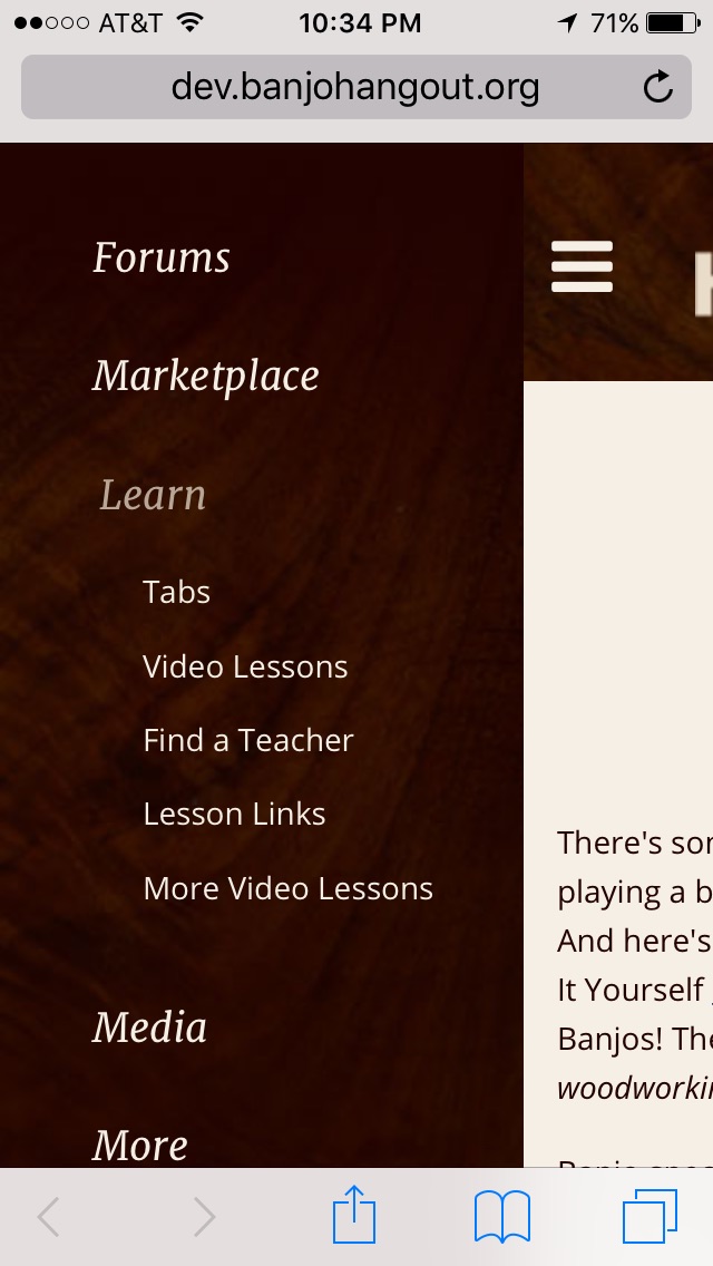
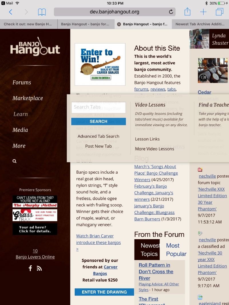
I have an iPhone 5s and an iPad Pro 9.7, both running iOS 10.3.2. On the iPhone, when I click on Tabs, I get a blank white screen. And the menus look very different on both devices. And it runs off the screen on the iPad Pro. See attached screen pix.
Doug Knecht - Posted - 09/07/2017: 20:02:01
You should number the replies in a topic, 1 2 3...etc.. so we can refer to "reply 7", for instance instead of always having to quote or multi-quote.
Edited by - Doug Knecht on 09/07/2017 20:04:23
Doug Knecht - Posted - 09/07/2017: 20:11:30
When changing photo on profile, after you upload an image off the computer it goes blank, although the new photo appears after you click "save changes."
schlange - Posted - 09/07/2017: 20:29:53
Yeah, uploading on the new site is going to be a bit funky until it goes live. There are some pages which are "shared" with the live site still, and that gets a bit messy. Another reason to get the new site live ASAP.
Omeboy - Posted - 09/08/2017: 06:38:41
Like the age old saying goes: "If it ain't broke---don't fix it."
I can't imagine why this change was necessary. The current design is so user friendly except for the new jukebox change.
If the "new" design had long been in place and we were now presented with the "old" or current design, I would say that the "old" design would be an exponential improvement for many good reasons. I find the "new" design to be a weak substitute and I will probably be visiting the BHO a lot less in the future.
Fathand - Posted - 09/08/2017: 06:40:18
I seem to be able to figure out everything I could before using my laptop. While I like the old one and am used to it, I believe I can get used to the new site.
I also tried viewing on my cell phone (android) and it is about 100% better than before. I can actually read forum articles now as they fit the page and I do not have to turn sideways, scroll back and forth and wear reading glasses anymore. Thanks
john bange - Posted - 09/08/2017: 06:47:04
Please help!!!!!!!!!!!!!WHERE ARE THE GROUPS? maybe I'm blind but I can't find them on the new site
From Greylock to Bean Blossom - Posted - 09/08/2017: 06:51:32
I read somewhere that groups were not being used and would be allowed to die a natural death. if memory serves correct.
ken
Omeboy - Posted - 09/08/2017: 06:55:25
It was always nice to see the names of other members "on line." Now that's gone. That's a real shame.
I also made the mistake of logging on and now I can't log off.
Tractor1 - Posted - 09/08/2017: 07:26:51
The groups are coming,Eric said so on page 3
other members online is there also ,click on the banjo players on line
Edited by - Tractor1 on 09/08/2017 07:29:44
Banjophobic - Posted - 09/08/2017: 08:11:06
This new BHO is a work in progress, so hang loose and let Sric do his thing. Thanks for saving the link to the chatroom Eric. I'm hoping the new BHO will be more iPad friendly too. As far as change goes, it's the one thing people fear the most but sometimes it's needed.
On that note, I don't see a reply with quote area yet, but I'm sure that's coming.
Edited by - Banjophobic on 09/08/2017 08:14:43
Tobus - Posted - 09/08/2017: 08:25:26
quote:
Originally posted by Banjophobic
On that note, I don't see a reply with quote area yet, but I'm sure that's coming.
It's the little icon at the bottom right of each post that looks like a piece of paper with an arrow pointing left. It's just to the right of the "Report Post" link.
phdm - Posted - 09/08/2017: 09:02:31
Question – on the new site, where do I find the groups that I, as a member, have signed up to follow? Sometimes I forget which ones I am members of, so I go to my profile, and see a list of the groups I am part of. Where is that on the new format?
Peter - Seattle
g-van - Posted - 09/08/2017: 09:32:17
Eric: Thanks for working on this! It is leaps and bounds better on my mobile devices. Something that you might want to take a look at is the email function within the classifieds. It works in prod but not in dev (maybe because it is in dev). In dev, I get the following error:
Microsoft VBScript runtime error '800a0046'
Permission denied
/pages/myhangout/sendmail_popup.asp, line 255
Also, in previewing this message I found the preview to be black text on black background. You might want to change something there.
Poco50 - Posted - 09/08/2017: 11:17:27
I would like to keep the chat room going even though i havent been on much lately....like has been mentioned in other posts, its a nice past time in the winter months and helps us to stay motivated in playing seeing other folks.
Havent seen the new design yet
Gary
Will Fastie - Posted - 09/08/2017: 12:20:52
quote:
Originally posted by Old HickoryI can't tell the color of the new quoted text or the background screen tint over which it appears. All I can tell is that I can barely see the text.
Colorblindness is a genuine accessbility issue.
It's more than colorblindness. The new color sceme is lower contrast, which makes it more difficult to read in general and especially for those over 50 (what's the demographic here?). The old site has black (#000000) text on WhiteSmoke (#f5f5f5). The "distance" between these is 96%, very high contrast. The new site is a dark gray (#230301) on a tan (#eeebdb), a distance of 79%. That may not seem like a lot, but it is easily noticed.
On that score, I'd advise pure black text.
The default font in the editor is also very small at 12px. I tried a couple of different sizes and thought 15px worked well. 12px is just too small on today's larger displays.
This is all fine tuning, but please don't discount readability. The forums are a big deal and they should be extremely approachable and very easy to read, regardless of platform.
Preview in the editor does not appear to be working.
Will Fastie - Posted - 09/08/2017: 12:32:11
I'm with you on the general notion of updating the site to deal with contemporary realities. And I recall vividly a friend of mine going ballistic when the "curved" design was first revealed (I thought it was fine but he just couldn't get past it). You can't please everyone.
That said, the site sure is bland. There was at least of hint of a banjo in the old curved left nav column. The only reason there is a banjo above the fold on the new site is the contest entry!
I would add a "Home" entry in the left nav. My experience with Web site clients is that the vast majority do not assume that a logo is clickable. Might be an age thing but I don't think so. I just don't think we've reached the point where it can be abandoned. If you don't agree, at least put it in the bottom site menu.
There is a lot of flatness in the new design, which I think is a mistake. See Flat UI Elements Attract Less Attention and Cause Uncertainty from the Nielsen Norman Group. Top notch research and good advice. An underlying result bears on contrast, which I mentioned in a previous post.
I know better than most that this is hard. I also know that "it ain't broke" does not apply - you and I both know that it was broken underneath and that a redesign was inevitable.
Will

TheOtherMarshal - Posted - 09/08/2017: 12:58:33
Eric,
This looks like a super smooth 'upgrade' to the site and I am looking forward to it.
Thanks for all you do for us!
T.O.M.
Bill Rogers - Posted - 09/08/2017: 17:09:12
Looks good, Eric. Much more open format is easier on the eyes.
WaylonWillie - Posted - 09/08/2017: 18:26:43
Eric: Thanks for your hard work and dedication to the site, not just now but over many years.
Here are a couple of quick comments as you tweak the design (I use a laptop rather than mobile). I'm posting these with the intention of contributing suggestions for the design, not as griping.
* I find the left hand bar to be quite large, and it is mostly empty black space. I bet you could get some more real estate by making it more narrow.
* pet peeve, but reduce the size of the type below the titles of the various forums (e.g. below "Playing Advice: Clawhammer" reduce the size of the descriptive text "Discuss playing old-time styles...."
* One neat feature I have seen on other forums is (on the page where the new posts are all listed) the ability to hover over the topic of a thread, and have it display the text of initial posting. I'm not sure if this is easy to implement, but it is quite handy. See an example here: sawmillcreek.org/forumdisplay....hal-Haven
Nancy - Posted - 09/08/2017: 20:22:03
I think much work and planning has gone into the new site.
Some changes. Life is made up of changes.
Nancy
schlange - Posted - 09/09/2017: 07:31:54
quote:
Originally posted by Omeboy
It was always nice to see the names of other members "on line." Now that's gone. That's a real shame.
I also made the mistake of logging on and now I can't log off.
Not gone. It's at the bottom left.
Lynne - Posted - 09/09/2017: 09:15:33
Mine always says 2 Banjo lovers online, however when I click the link there it shows 69 people online. Does that mean 67 people don't love the Banjo?
rgoad - Posted - 09/09/2017: 09:20:10
Checked it out on my Mac. Really like it.
On my iPhone I still have issues with the side panels, such as the login and log out. I could not decipher the logout location on my iPhone at all. Phone view is OK in Portrait, landscape view shows side panels cut off vertically down the middle. Am I sizing it wrong?
A+ for the desktop version, D for the mobile view that I found.
Tractor1 - Posted - 09/09/2017: 09:46:16
I never know the'' time of day ''I last read a forum discussion I was involved in. I always remember who made the last comment.This lets me know whether to go to said forum or not,It seems to not be there on the new one I can't find it ,nor a workaround .
Even to the point of swapping it out with how many had read.or the time of the last post imo
Edited by - Tractor1 on 09/09/2017 09:55:54
rgoad - Posted - 09/09/2017: 10:51:04
quote:
Originally posted by Tractor1
only 1 banjo lover online now,someone OD ed
Saw the same. However, if you tap the number the actual roster of people shows up and it is much more. So I think it is a metric conversion issue. Or an assumption that banjo players can't count people any better than they can count time...
Terms of Use | Privacy Policy | Privacy Consent (EU/GDPR Only)
Copyright 2026 Banjo Hangout. All Rights Reserved.


