
DVD-quality lessons (including tabs/sheet music) available for immediate viewing on any device.
Take your playing to the next level with the help of a local or online banjo teacher.
Weekly newsletter includes free lessons, favorite member content, banjo news and more.
Premier Sponsors


|
Please note this is an archived topic, so it is locked and unable to be replied to. You may, however, start a new topic and refer to this topic with a link: http://www.banjohangout.org/archive/285606
Shake-Boy - Posted - 05/28/2014: 09:36:22
Hey everyone,
Jeffrey Weitzel ( weitzelbanjo.com if you're unfamiliar with his work) is in the final stages of building a banjo for me. All that remains is putting a finish on the maple, assembly and setup. The fingerboard is ebonized hickory while the rest of the banjo is maple. The bronze and brass parts have had patina applied. The clear head will go away and be replaced with white frosted head.
I'm interested in your opinions as to finish. So far I've had something with a touch of amber as one suggestion. I've been partial to darker finishes and I generally shy away from anything that has any orange, amber or blonde but something in the amber family might work here. I'm looking for something that contrasts nicely with the ebonized fingerboard, tailpiece and armrest yet doesn't clash with the colored inlays. Whatever I choose will be a satin finish as I don't like the deep, ultra shiny gloss finishes. What finish do you think would look good on this one? It's unconventional in construction so unconventional in color would be fine with me. Any ideas?
Four pics of what it looks like so far below. I'd be grateful for any input at all. So whaddaya think?
Sincerely,
Shake-Boy (Paul)


Edited by - Shake-Boy on 05/28/2014 10:18:45
rudy - Posted - 05/28/2014: 09:42:05
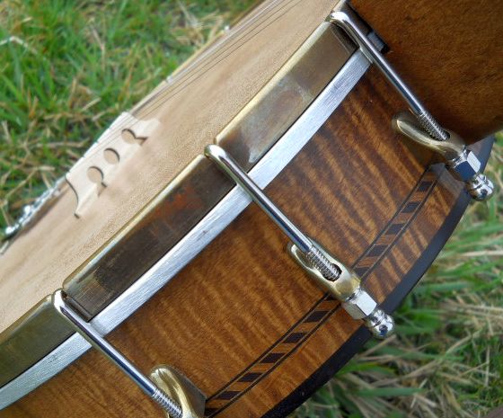
My favorite stain is Transtint (Homestead Industries) Vintage Amber.
xnavyguy - Posted - 05/28/2014: 09:42:52
If it were mine, I would use Tung Oil finish which would bring out the wood grain but not darken it too much.
Edited by - xnavyguy on 05/28/2014 09:43:13
Crusty - Posted - 05/28/2014: 10:02:37
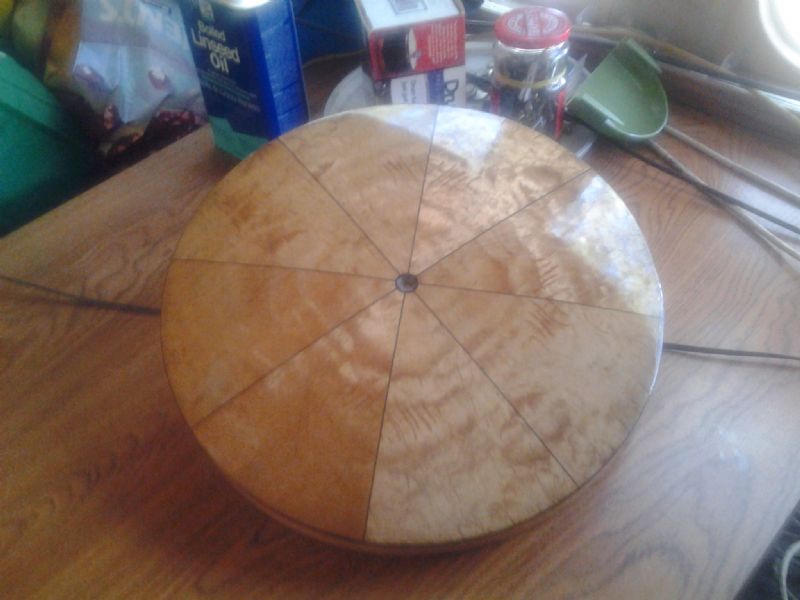
Here's my Vega resonator in blonde maple (no stain) with a Tru Oil gunstock finish. I think it's a mixture of linseed and tung oils with some other ingredients.
 Reso 2 |
Mad Jack Gallows - Posted - 05/28/2014: 10:10:37
I really like that Vintage Amber that Rudy posted. I have an oak neck with a very colorful fretless cocobolo fingerboard, and on the oak I am planning to use a very similar color using a trick that Dan Drabek showed me, by dying the wood amber then going over it with a dark walnut stain and wipe on poly finish. Looked a lot like what Rudy posted, how its nice and dark but with a nice amber glow to it.
Edited by - Mad Jack Gallows on 05/28/2014 10:11:44
buckholler - Posted - 05/28/2014: 10:27:25
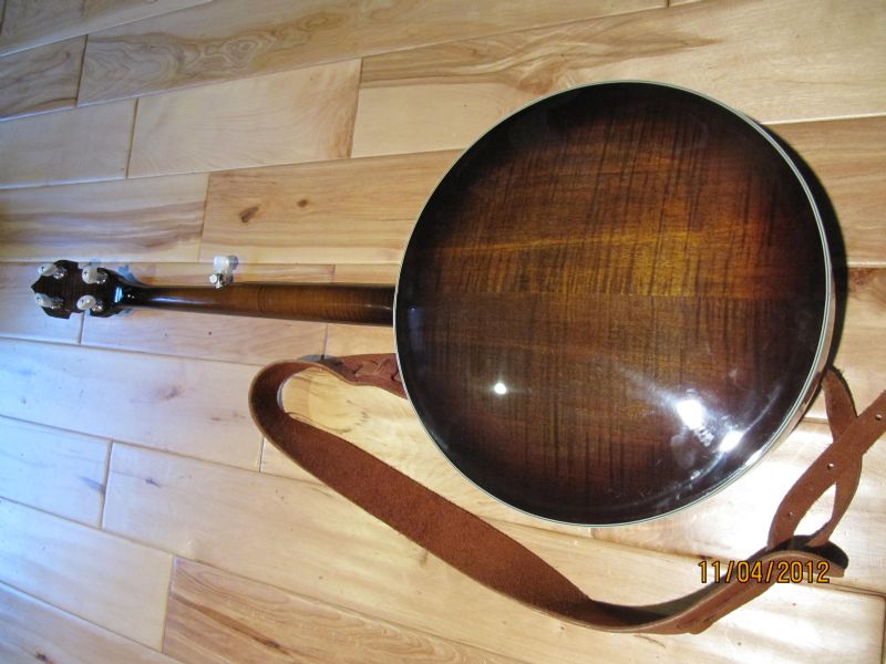
I like darker finishes. Heres a pic of my Rigel banjo. I really like the color. Are those little dot on the top of the neck the capo system for the 5th string?
Edited by - buckholler on 05/28/2014 10:29:46
 |
Ken LeVan - Posted - 05/28/2014: 10:32:04
I would leave it blonde. Staining it will kill the two-tone curly maple.
Weitzel - Posted - 05/28/2014: 12:55:18
Hi Paul. My wife thought it would be best to give her opinion in her own words (as opposed to my version that I emailed you - imagine that!). She was going to email this, but I thought it might be more interesting to just post it. Here it is (can you tell she is a painter?):

"Any of the color will make a contrast, yes. What makes a contrast more vivid though is not always equal. Let's look at values in comparison. I do not have the color sample in front of me, so it is not accurate, but what I recall is that the natural/ no stain(? Do not know exactly what to call it) has the lightest value of all. This means that it will make the highest contrast of all color options.

Oranger color vs. Browner color:
The color orange has a character. It can talk too loudly, depending on what you like, but it will make the feel of stronger contrast than Brown. The brown one makes the contrast quieter. Notice the values of these two colors are about the same, I believe. So, the color is making a trick on our eyes. Now we are dealing with color combinations on top of contrast, and it is important as it makes a subtle yet significant difference. Example of color combinations affecting the contrast to our eyes is Degas' paintings. If you turn them in black and white, they would not look as exciting as they are in full color. He, of course, used the complementary colors and cool and warm color combinations to trick our eyes to get excited. Is any of the color choice complementary to the color of the neck? Not really, but having different color/ pigment or warm/cool color combinations affect differently. Warm colors jumps right at you versus cool colors sit back nicely in the background.
That is why, it is your decision. It goes back to what you like best.

My personal pick is the no stain, the most transparent option. The reason why is that it appears to be the most graceful color combinations as well as the highest contrast that I like to see personally. With all other colors and shapes and designs in consideration, that is. I do not always go for the same colors for everything as shape, design, texture, etc...influence a lot. Any combination will probably be fine, other than personal taste, but you need to give the first priority to your personal taste, of course. To me, I might like orange, but have some concerns that I might get tired of it. Brown one is quiet in contrast, so may not get tired of it easily, but my personal taste goes for the highest contrast in this particular case, as I want the neck color and design to be the focal point of the banjo. The natural color does not talk loudly(thus making it as the safe option, will not get tired easily), yet brings the highest contrast, keeping your focal point back to the neck to the dark blackish brown and stars after eyes go all over the banjo. Orange one, for me, my eyes travels back and forth between the neck and the back, then maybe back, not going back to the stars and the dark stains as the final focul point as strongly, because warm color tend to come forward. To me, the stars and the dark stain side is the front of the piece of art even though the back is also beautiful. I personally think this piece has a front and a back feel though some sculpture do not have any back or front, one as a whole. Anyway, I want to have that sense of "front" and "back" feel from this banjo, I guess.
That is my analysis of my personal preference.
Hope it was helpful in some ways."
Just so BHO People know what the "orange" and "brown" are that she is referring to are, here are photos of some color samples I emailed to Paul. The top stripe(first photo) is the "orange", second stripe is "brown" (actually both are a blend of various dyes), and the bottom stripe is just plain shellac. I personally think that having just a little color of some sort helps to bring the figure in the grain out a bit more. A nice amberish tone of some sort (both samples here are at least half amber), even if very light will help the grain and still look quite natural, maybe a just a bit aged.
Jeffrey (and Sanae)


tomberghan - Posted - 05/28/2014: 13:07:53
quote:
Originally posted by Ken LeVanI would leave it blonde. Staining it will kill the two-tone curly maple.
I'm with Ken . . . but I like a nice Honey color stain with deep layers of lacquer (like Gibson often did). It brings out the flames! Not orange (don't like that) but the rich color of honey.
Like this Super 400 Archtop. The flames jump out and have a deep warm honey color:
Ken LeVan - Posted - 05/28/2014: 13:46:04
I kind of remember that the design brief for this banjo was "mid century modern", and I tried to get more info, although I might be thinking of a different banjo. Anyway, that was part of what made me suggest the blonde finish, because that's the way something like that would have been finished in the mid century modern period period - au naturel. Teak was also very popular, but never stained dark.
Apropos of this, and what Tom Berghan said, you have to build up the color, often starting with an ugly florid tone, and toning it down - keep going darker in stages, little by little.

When you finally start to lacquer it, it actually gets lighter, but the contrast increases.
Anyway, I would vote to keep this banjo blonde, as I said earlier. To quote DK Chesterton "easy to be heavy, hard to be light".
Ken
Weitzel - Posted - 05/28/2014: 15:09:53
Ken - Yes, this is the same banjo. Great pictures. You always have very clearly presented process pictures that I can appreciate. Makes my little sample stripes look quite thrown together, which in fact they were, in order to get a simple color range idea to hold against the dark wood.
In my own research of mid-century furniture and architecture design, I find wood finish colors all over the place from dark to natural, but always showing the grain prominently.
Tom, that is a beautiful archtop back!
Dan Drabek - Posted - 05/28/2014: 15:13:56
I love it all. Maple is beautiful stuff.
If you do intend to stain, the stain, if applied properly, can actually enhance the contrast of the curls. That's because the dark parts of the figure absorb the stain more deeply than do the light parts. To really intensify the grain and color, you can stain the wood, lightly sand it--which removes most of the stain from the light areas but little from the dark areas--and stain it again.
Whether you like or dislike the strong figure is a matter of taste. Some folks like the wood looking just as nature made it. Some folks, prefer the "more the merrier" look. I appreciate both looks. The cleaner, no-stain look I think, is a more modern esthetic, while most antique maple pieces tend to be heavily stained.
DD
Weitzel - Posted - 05/28/2014: 15:22:13
Dan - Your photo is very helpful because it shows a satin finish (which Paul is looking for) and a very dark wood (again what Paul is going for) to contrast with the maple. It also appears to be warm without being "orange-y". Beautiful neck!
Dan Drabek - Posted - 05/28/2014: 15:59:54
Thanks Jeff,
This particular neck was loosely inspired by 19th century Pennsylvania/Kentucky long rifles. The wood has been stained and sealed, but no finish has yet been applied. I'm still vacillating between a matte or gloss topcoat.
DD
Weitzel - Posted - 05/28/2014: 18:00:09
Dan, my vote is for the matte, because I really like how it looks right now. I also have hard time picturing a glossy 19th century rifle.
60spicker - Posted - 05/29/2014: 09:34:52
My opinion? Too light makes that wonderful fretboard look like a mistake. If it was rosewood, maybe. I like the brown stripe or Rudy's amber.
rudy - Posted - 05/29/2014: 11:26:04
quote:
Originally posted by 60spickerMy opinion? Too light makes that wonderful fretboard look like a mistake. If it was rosewood, maybe. I like the brown stripe or Rudy's amber.
Very astute observation.
As in the post above relating to color intensity, IMHO variations of color intensity should be somewhat aligned to prevent an instrument from displaying "Barber Pole Syndrome". If you prefer stark contrasts that's OK, and I certainly enjoy the contrast between light pearl and dark fret board, but other than that I prefer wood and stain choices that blend harmoniously. But that's just me.
Shawn Hoover - Posted - 05/29/2014: 16:41:49
Blonde, vintage amber, three phase grain fire dye application.. it's all good. Need more inspiration still?
Here are some guitars with amazing chatoyance in blonde: acousticguitarforum.com/forums...mp;page=2
An archtop from Comins in blonde with a fretboard with shades of brown similar to yours.
I'm nominally opposed to orange, like you, but it's hard to argue with the stuff coming from the Romero and Buckeye shops.
How's vancebanjos.com/assets/...index.html">this deep black Vance banjo for something unconventional?
Like Sanae said, whatever you pick will look good 
Shake-Boy - Posted - 05/29/2014: 21:01:43
Thank you to all who took time to weigh in on this. I've been working too many hours the past few days and haven't had time to look your posts over in detail. It'll take me another day or two to get on 'em.
spoonfed - Posted - 05/30/2014: 02:03:23
I am a complete sucker for pie crust resos so, I just love Crustys Vega ! anything that enriches and brings out the depth of the wood grain would work for me, you just cannot beat a beautifuly applied finish, wish I had the expertise to say something more constructive but, I have just enjoyed looking at all these beautiful finishes ! Sure looks like a nice banjo, look forward to seeing that lovely grain when finished.
Shake-Boy - Posted - 05/31/2014: 11:52:47
quote:
Originally posted by buckhollerI like darker finishes. Heres a pic of my Rigel banjo. I really like the color. Are those little dot on the top of the neck the capo system for the 5th string?
I finally got time away from work to look at this thread in detail.
Yes Scott, the dots on the neck are the 5th string capo system that is operated using rare earth magnets.
Terms of Use | Privacy Policy | Privacy Consent (EU/GDPR Only)
Copyright 2026 Banjo Hangout. All Rights Reserved.


